My final piece for my close-up project
Below are copies of my final piece photography for this project. I have explored close-up photography in different ways and developed skills as highlighted in my work around Brunelli and Keetman. I decided that I wanted to use the beach images after looking at Stephanie Jung's work and I am really pleased with the results. I have taken the idea of layers of the same image and made some slight changes. Using images of a beach rather than a city scape was a challenge and I also have added some layers with different treatments such as black-and-white and extreme colour saturation. I have also investigated changing colour in some images after looking at Jan Groover's work but this has not been successful and has therefore been left out of my final piece.
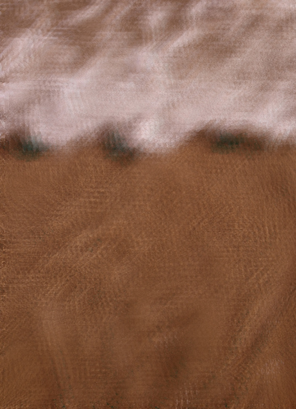
The left-hand photograph is an image with layers repeated many times and one layer being high-contrast black-and-white. This first image reminds me of the softness of there water as waves break on the beach.
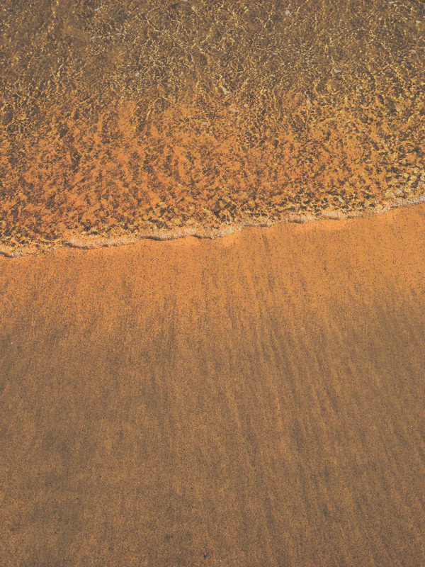
The right-hand image is much more about how I remember the sand reflecting the bright sunlight. This caused the sand to seem almost metallic and the treatment of this image is layers with one layer reversed to negative and then adjustments to opacity and the curves for the red colours. The colours in this image remind me of Jan Groover's work and I have been influenced in my photography and how I used Photoshop in making use of a small range of colours.
I could certainly improve the final piece by experimented with blending and possibly adjustment layers although my method of adapting images before adding as layers helped me to see and understand better the process of using layers and layer opacity.
My final pieces -
The left-hand photograph is an image with layers repeated many times and one layer being high-contrast black-and-white. This first image reminds me of the softness of there water as waves break on the beach.
The right-hand image is much more about how I remember the sand reflecting the bright sunlight. This caused the sand to seem almost metallic and the treatment of this image is layers with one layer reversed to negative and then adjustments to opacity and the curves for the red colours. The colours in this image remind me of Jan Groover's work and I have been influenced in my photography and how I used Photoshop in making use of a small range of colours.
I could certainly improve the final piece by experimented with blending and possibly adjustment layers although my method of adapting images before adding as layers helped me to see and understand better the process of using layers and layer opacity.
My final pieces -
At the end of this project I can look back and see how I have developed skills in my camera work as well as using Photoshop in different ways. The imagers above are a success for me as they show development of ideas as well as being successful in my ambition to show how I experienced the beach when I took the pictures. I have used a very uncomplicated composition in both images and they are unified with the effect of having the water at the tops of each image. I wanted to keep both images very simple and without distraction in order to maximise the effect of the treatment on the sand and water's edges.
After looking at Peter Keetman and his portrayal of metal objects and Jan Groover's work in colour I feel that I can see influence of these in my work. I look forward to developing these ideas and more abstract photography in my next project.
After looking at Peter Keetman and his portrayal of metal objects and Jan Groover's work in colour I feel that I can see influence of these in my work. I look forward to developing these ideas and more abstract photography in my next project.